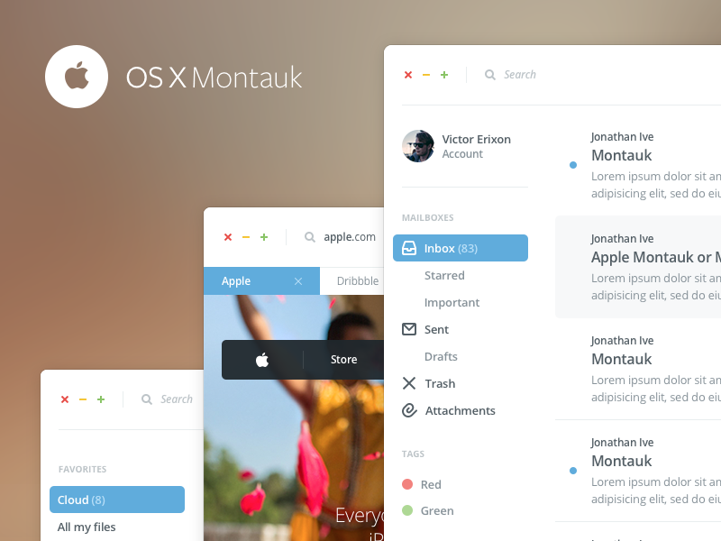
… at least not good design for the end user.
I know that redesigning things is fun. Those little projects often turn out to look great and have a lot of visual appeal to them. What people tend to forget though, is that interfaces not only have to look good, but they have to actually work well and be as easy to use as possible and that is not the case in this shot.
Don’t get me wrong, Victor Erixon did nothing wrong with posting his shot and I too do like it visually, but responses like
“Fuck my life. This is amazing Victor!”
or
“I love all of it! I, for one, think it’d be awesome if the next OSX looked like this.”
from people I really respect in our industry, kind of makes me sad and wonder if they are all just about making something look cool for their egos sake, rather than put a single thought into how this would actually work for your real life average Joe user. From my point of view, one happy user is worth more than a thousand likes on a dribbble shot.


